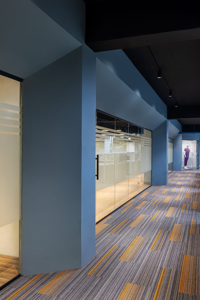
The Infinite Ceiling: An Industrial Canopy
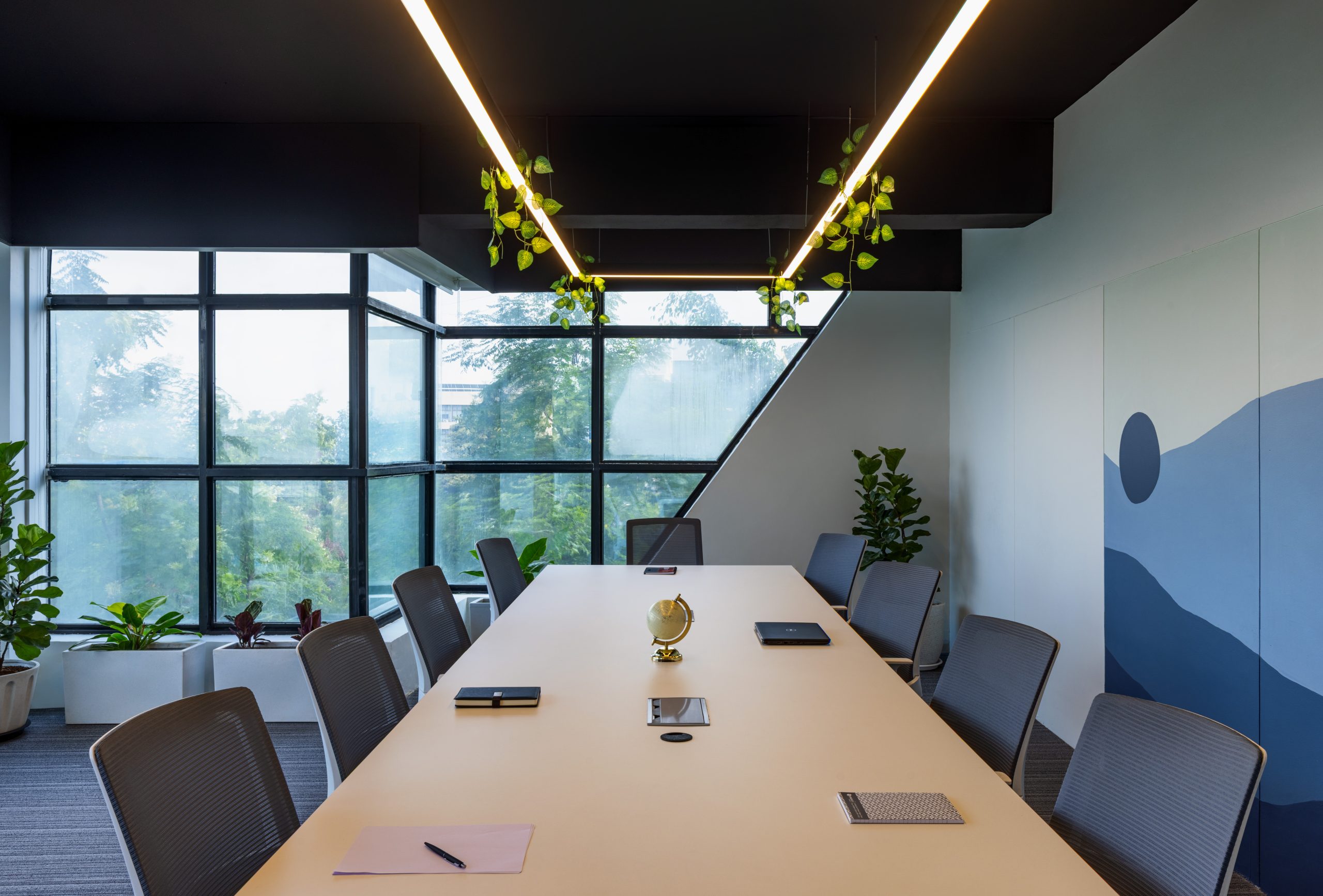
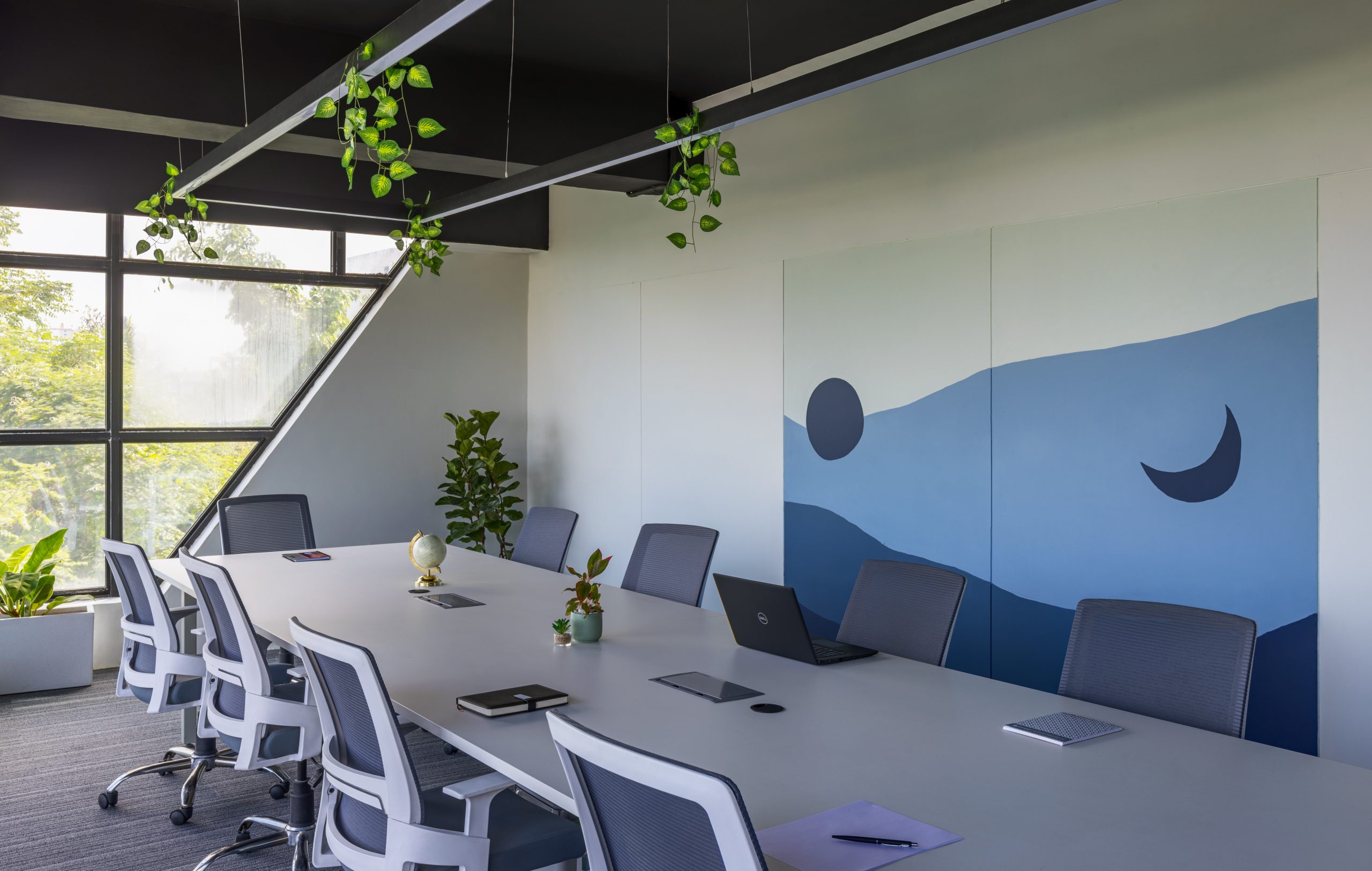
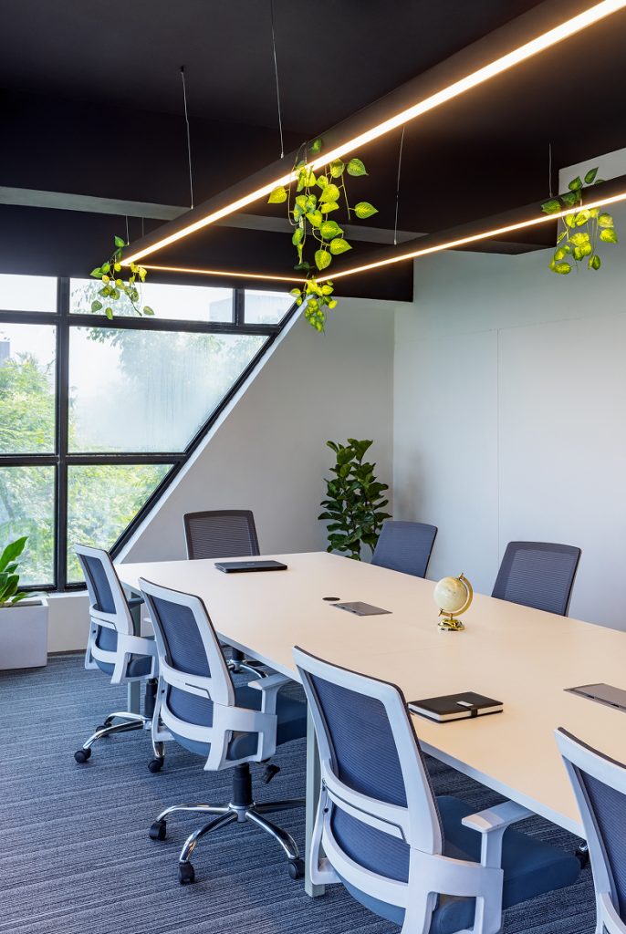
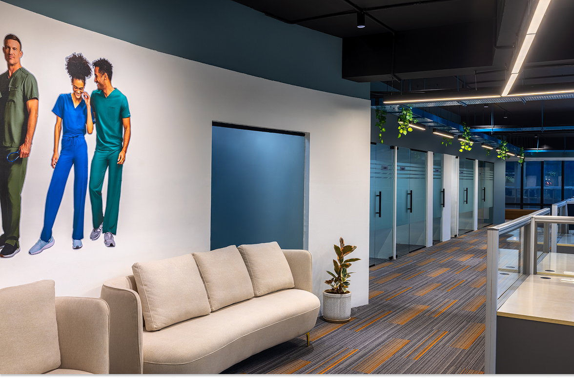
Perhaps the most striking architectural decision in this project is the treatment of the ceiling. In a bold departure from standard corporate aesthetics, the designers chose to forego the ubiquitous false ceiling. Instead, the raw shell of the building—ducts, pipes, and concrete slab—has been left exposed and sprayed in a deep, matte bold black.
This decision serves a dual purpose. Aesthetically, it lends the space an undeniable industrial edge, a nod to the “loft” aesthetic that suggests creativity and innovation. The black paint acts as a void, masking the visual clutter of the services while creating an illusion of infinite height. Spatially, this adds volume to the floor plate. By not boxing in the room with gypsum boards, the office feels expansive and airy.
The contrast is poetic. The heavy, dark machinery of the ceiling “disappears” into the darkness, allowing the pastel hues of the workspace below to pop with greater vibrance. It is a visual grounding technique; the black ceiling acts as the night sky, while the workspace below reflects the light of day.
The Work Zones: A Symphony in Blue and Grey
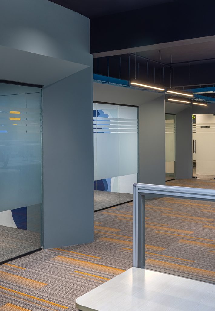
Below this industrial canopy lies a workspace designed for deep focus and clarity. The general working areas are washed in shades of pastel blue and cool grey, punctuated by crisp white furniture. This color psychology is deliberate. Blue, known for its ability to lower blood pressure and induce mental clarity, transforms the open floor plan into a zone of serenity.
The interplay of light grey flooring with white workstations creates a seamless flow, preventing the space from feeling segmented or claustrophobic. The pastel blue acts not just as a color, but as a texture, softening the hard lines of the architecture. It reflects the natural light pouring in from the exterior glazing, ensuring the office remains luminous throughout the day without the harshness of pure white walls.
The Soul of the Space: Hand-Painted Narratives
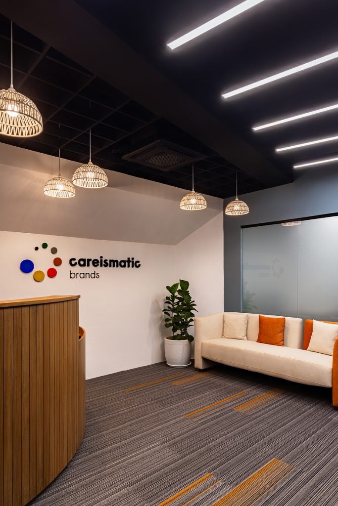
While the architecture provides the structure, the art provides the soul. The stand-out feature of this Pune office is undoubtedly the inclusion of bespoke, hand-painted murals. Located strategically on the walls of the conference room, the private cabins, and the canteen, these murals inject a layer of humanity into the minimalist shell.
In the conference room and cabins, the art serves as a conversation starter. It breaks the monotony of the solid pastel walls, introducing organic shapes and narratives that contrast with the linear nature of the furniture. These aren’t generic vinyl prints; the brushstrokes are visible, reminding the user of the human hand behind the creation. They add a bespoke luxury to the office, suggesting that this space was crafted, not just assembled.
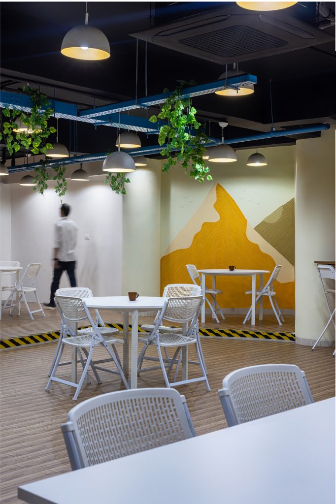
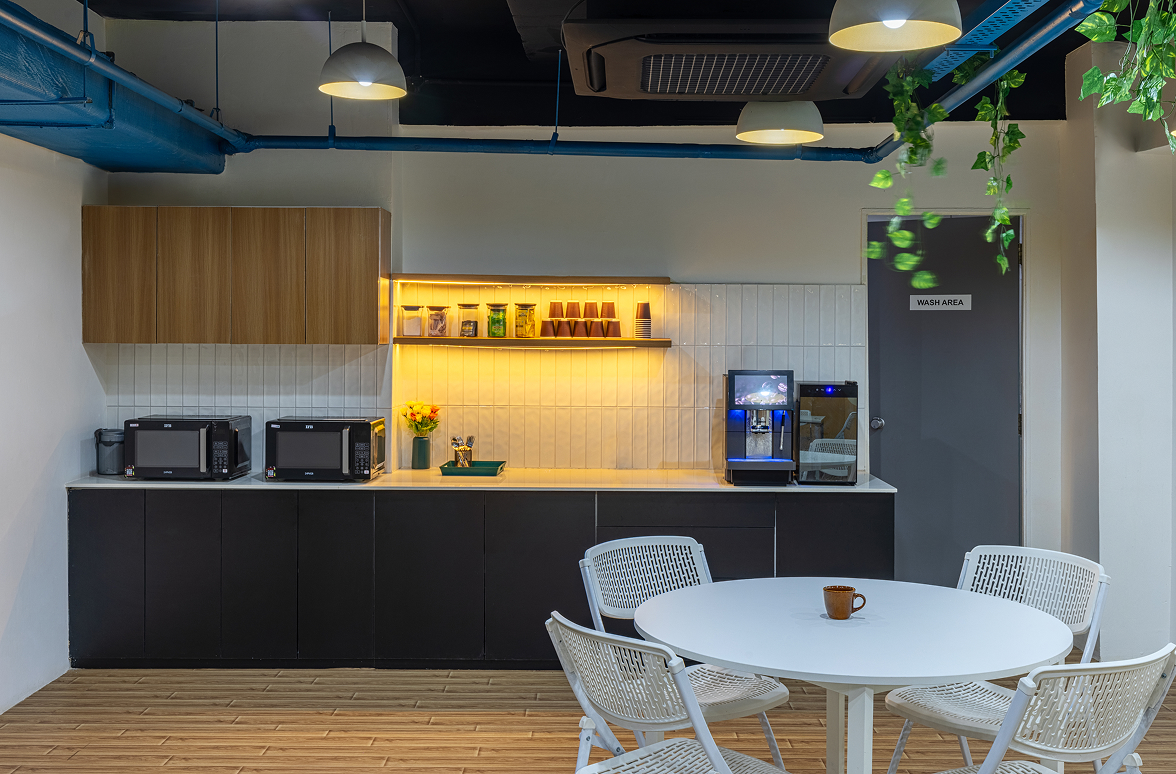
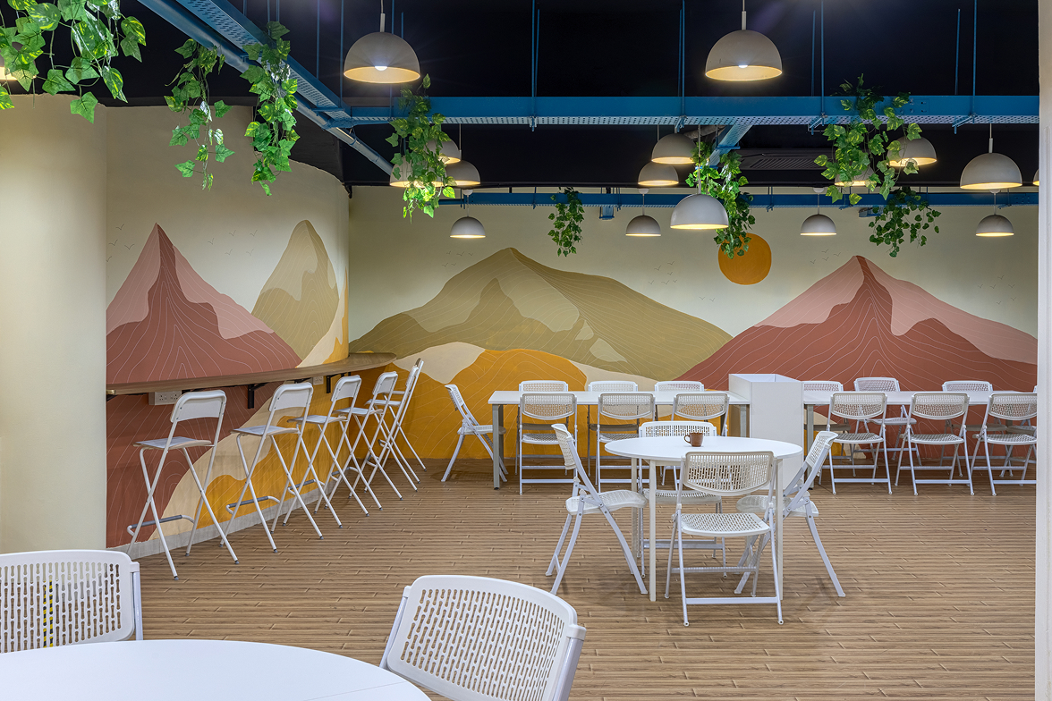
The Canteen: A Burst of Solar Energy
The brilliance of the design layout is most evident in the transition from the work zones to the breakout areas. The designers have utilized “color zoning”—the practice of defining space through hue rather than physical partitions—to separate labor from leisure.
Stepping into the canteen feels like walking into a different time of day. The cool blues and greys are abandoned in favor of a warm, energetic palette comprising yellows, oranges, and earthy rusts. This shift is jarring in the best possible way. It signals to the brain that the work session is over and it is time to recharge.
The rust and orange tones stimulate appetite and conversation, fostering a social atmosphere that is distinct from the quiet focus of the blue work zones. The murals here take on a more playful character, complementing the vibrancy of the furniture. This visual distinction is crucial in a modern office; it allows employees to mentally detach from their tasks simply by walking into a room that looks and feels fundamentally different.
Conclusion
This project in Pune stands as a testament to the power of color and volume. By refusing to hide the building’s skeleton and instead celebrating it with bold black paint, the designers have created a container that holds the soft, pastel interior with strength and elegance.
The juxtaposition of the industrial ceiling with the delicate walls, and the cool work zones with the fiery canteen, creates a dynamic rhythm. It is a space that understands the modern worker needs clarity for the mind, inspiration for the eye, and a distinct boundary between work and play.